Pattri
Identity
Branding
Packaging
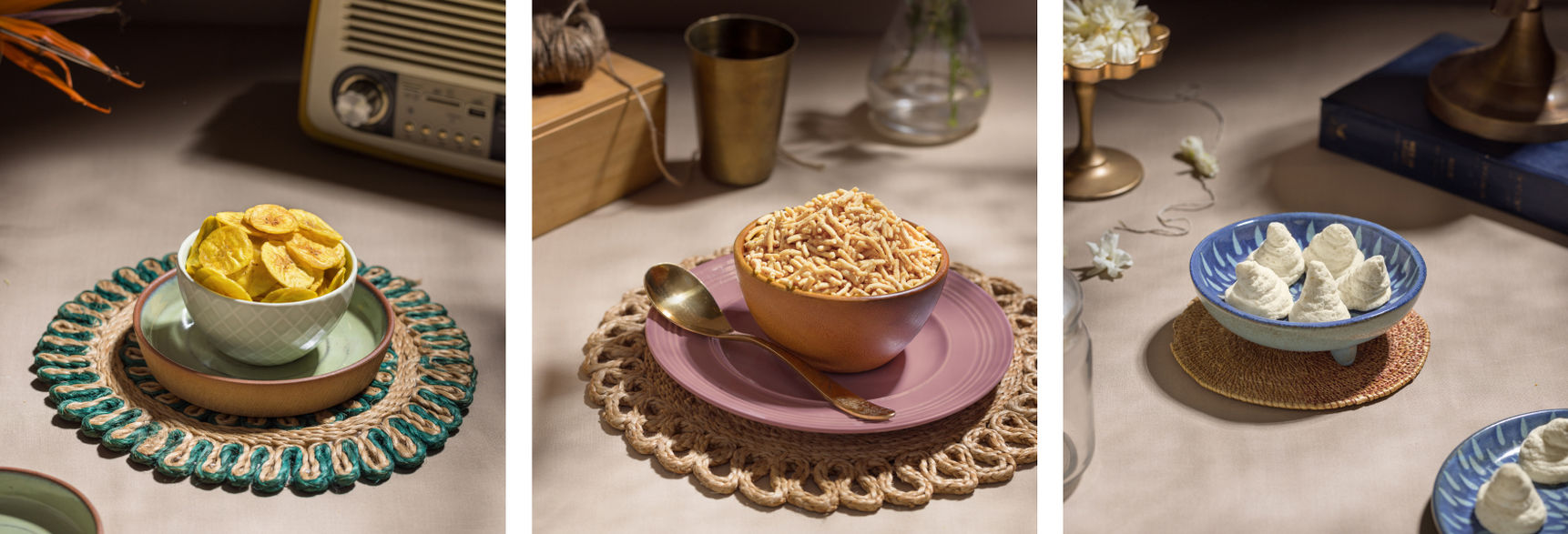
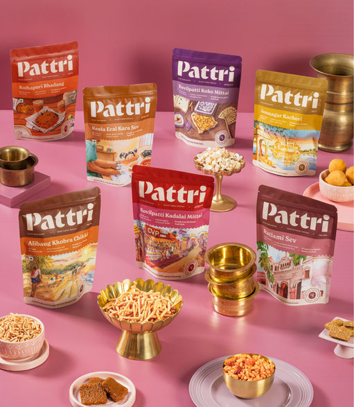
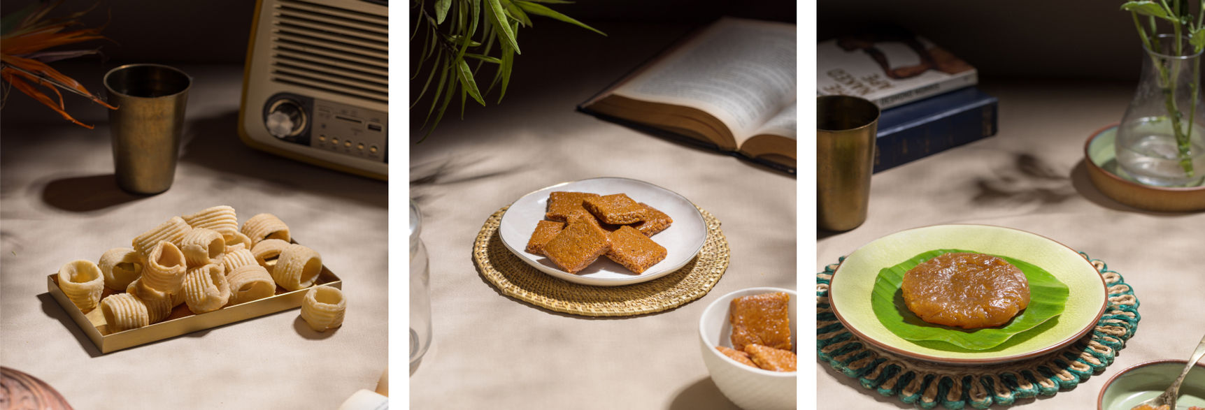
Pattri is a regional food brand that sources high quality, locally made and locally famous goodies across the length and breadth of India and makes them available everywhere.
Spearheaded by founder Paul Berkmans Thevar’s passion for India’s regional culinary gems, Pattri’s journey with Thought Over Design began in early 2022. Our task was to shape a yet unmade brand into something that would capture the hearts and imaginations of food enthusiasts across India.

Paul shared his own inspiring experiences as a student, observing the iconic halwa sellers of his native Tirunelveli and his belief that food can help people discover and connect with their culture in a way few other things can.
With a 1-on-1 conversation, we understood the ins and outs of the brand being created, as well as founder intent. Paul shared with us his own relationship and beliefs around regional foods of India and the a-ha moment for creating this brand. It also unearthed a few hypotheses that we could explore further in the research phase.

Found the purpose
Our brand wanted to become a window into the rich and hitherto unknown world of local delicacies that could give people a taste of their native lands.
We believe that exploring India's food landscape is an incredibly exciting and beautiful way to experience and preserve our cultural treasures.

Brand Identity
Taking inspiration from the changing tracks that lead to new discoveries, we created a simple but iconic mnemonic that could be the face of the brand. We designed it as the Devanagari alphabet 'प'. The wordmark was inspired by the stencil typefaces we encounter through different mode of transports and is designed to stand out in retail.

Packaking System
We created a system of information for the packaging that allowed for the brand to land impact, while still be visually compelling.

Handcrafted illustrations
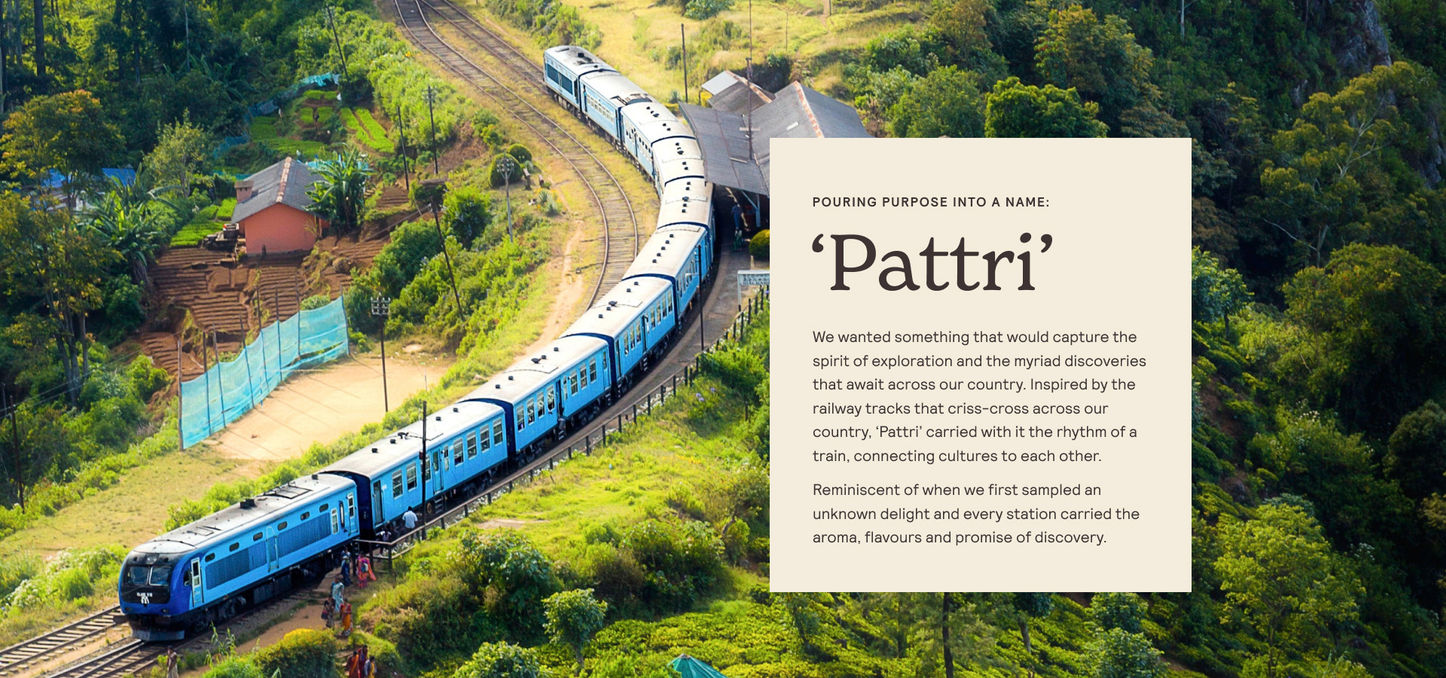
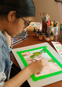
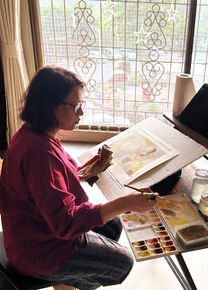
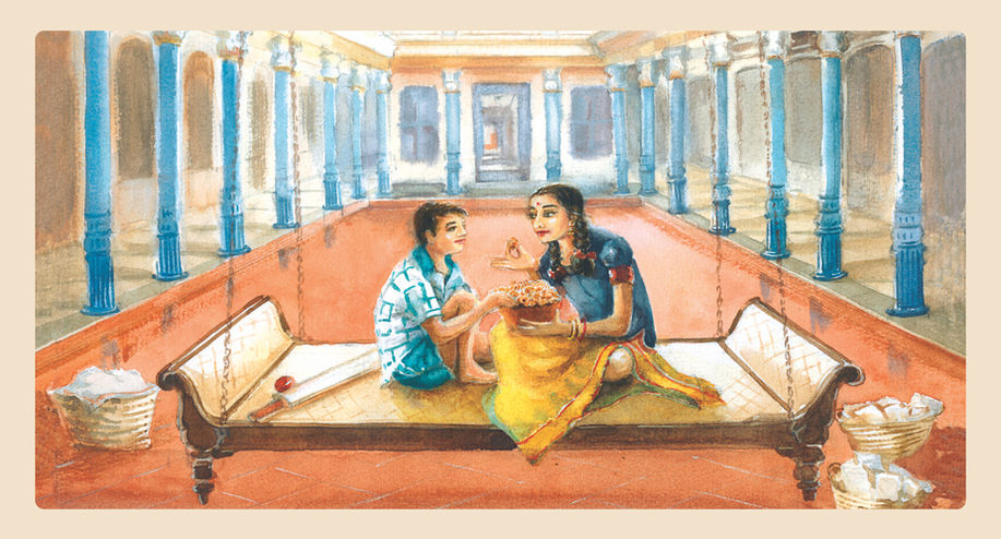
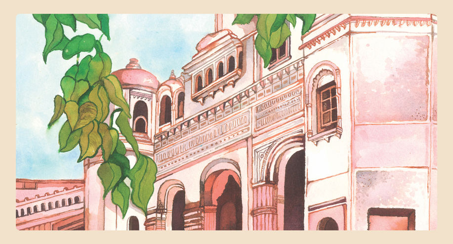
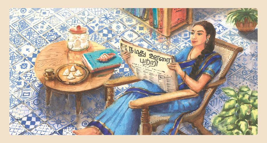
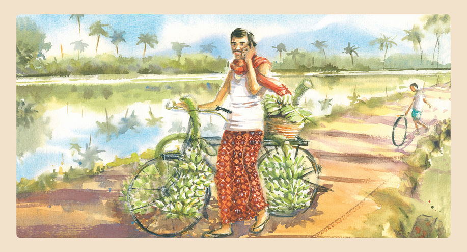
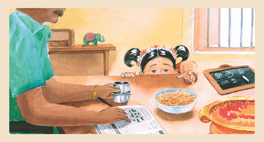
Partnered with artists to create bespoke illustrations for our packaging. Each handmade watercolour illustration was a mood image that would be incorporated on our packs. These illustrations captured the vibe of the place our foods came from or a mood and moment of consumption.

Journey of the packs
The process from concept to the final illustration on the packaging was layered. Each of them involved understanding the product, the cultural context in which it existed, the way it was eaten and even the rituals around it.
Understanding the product and its history
Conceptualising the illustration
Colour Palette Inspiration
From Painting to Packaging


Visual language
The scallops that are often seen on shop front awnings are an integral part of the visual system. They also represent the array of products that the brand offers. To further complement the visual language, we created a set of icons that represent different elements from India’s food, places, and culture.


Packaging
The unboxing experience highlighted the brand attributes and tone of voice through the delivery box and the brand insert. We designed "tickets" to the places where the products originated from that told interesting anecdotes or facts from the region.


Social media
An important brand building priority for Pattri was to bring alive its brand world to prospective consumers. Instagram was the chosen medium for us as it is a platform for food, travel and lifestyle-related conversations. Through a targeted strategic and creative ideation module, we created a social media launch plan with key assets needed to establish the world of Pattri.


