The Whole Truth
Identity
Branding
Packaging
The Whole Truth (formerly And Nothing Else) aims to rebuild the world’s trust in food, through 100% clean food products, honest packaging and creating educational content about food and fitness.
Over the last three years, we’ve worked as design partners with the founder Shashank Mehta and The Whole Truth team to create the new brand identity and it’s evolution.
From the naming and identity design to the launch of various new product ranges across categories, we worked together to build a distinct presence and aesthetic in the world of packaged food.

PURPOSE-LED
REBRAND
The problem with food brands is that they lie. Or tell self-serving half-truths. The purpose of the brand was to challenge this status quo for consumers.
Our strategic process, through workshops and brainstorming sessions led to a sharp purpose, which then informed the entire rebrand exercise that followed.


LARGER PURPOSE = NEW NAME
THE WORLD OF ANNOTATIONS
The brand was renamed to capture the larger purpose that the brand set out to fulfill: Being honest about about not just the ingredients, but everything. With this intent, The naming focused on cues of honesty and transparency.
Designed the new identity around the concept of a ‘good kind of vandalism’, since the brand was already known for identifying and marking up half-truths or false claims found on food packaging, to build the whole picture for their consumers.


THE IDENTITY
While other brands tell you some versions of ‘The Truth’, this brand aimed to add the word ‘Whole’ to paint the bigger (and honest) picture. We translated this concept into the word mark and it became the core principle of the brand identity.

The visual language of the brand grew into a whole set of mark-ups, annotations and doodles.
These would add to the existing, visible imagery to build a larger message with copy and illustrations.
We also created the format of Whole Truth statements which became iconic for the brand.


Protein Bars
Protein bars were the first flagship product range of the brand, and the new identity launched with the refreshed protein bar packaging design.
We designed these bars with a clean, typography led approach with ‘Truth Statements’ for each variant. This system continued for some of future ranges as well.


Avenir Light is a clean and stylish font favored by designers. It's easy on the eyes and a great go-to font for titles, paragraphs & more.
Meet Barry, an unofficial mascot for the brand. Designed to be the voice of ‘truthful packaging’ he’s witty, friendly and he knows a lot about food.
Oh and in case you missed it, he’s the protein bar, personified.


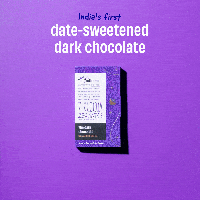
Dark Chocolate
Illustration for packaging
TWT dark chocolate is India’s first date-sweetened dark chocolate. Made with only cocoa and dates, it’s a 100% clean chocolate. Dark chocolate is a more premium and elevated space, and we designed this range to be visually intricate and decadent looking. Each of the bar had it’s own story that was translated into detailed illustrations.